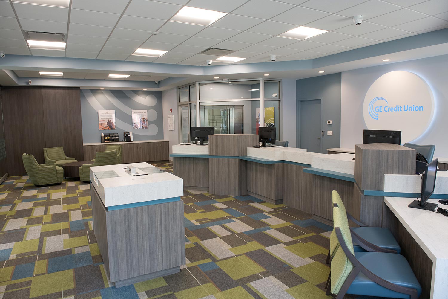
This client wanted a fresh new branch layout for their first New Haven office, with the chief requirements being flexibility and impact. The design we developed gave the credit union a whole new look, with our brand designer delivering a beautiful contemporary brand presence that the credit union loves.
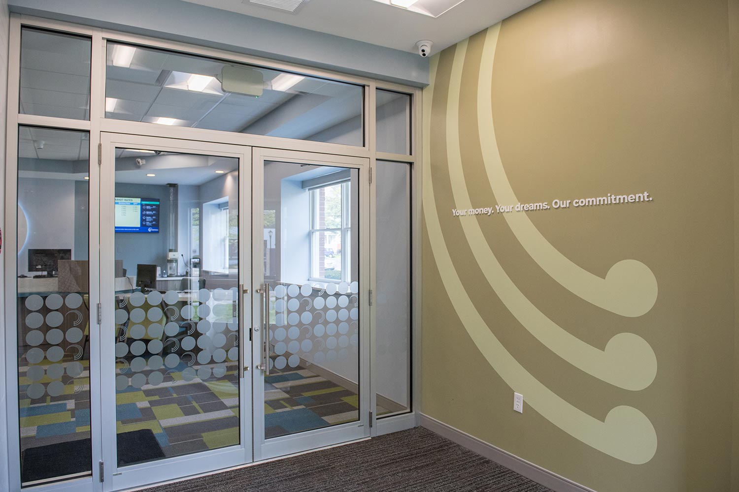
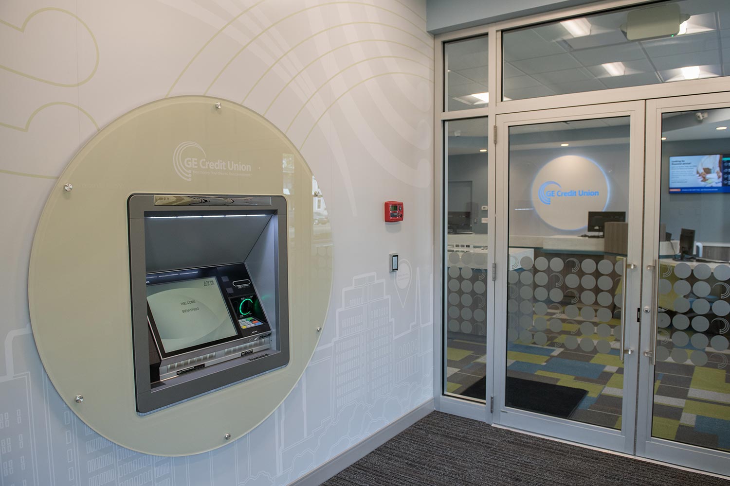
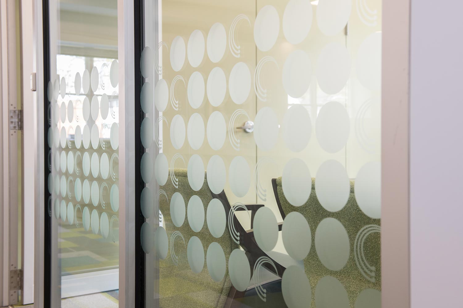
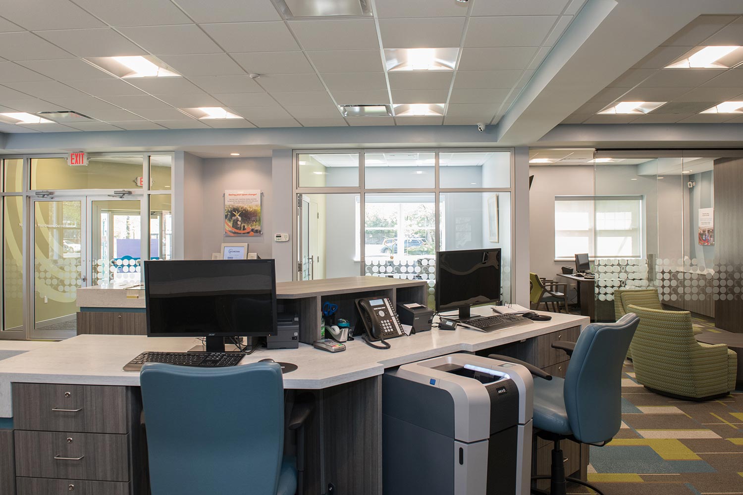
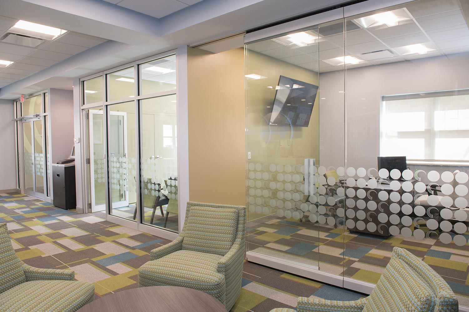
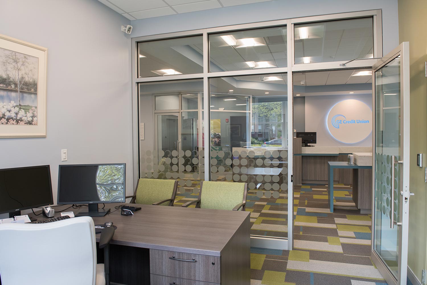
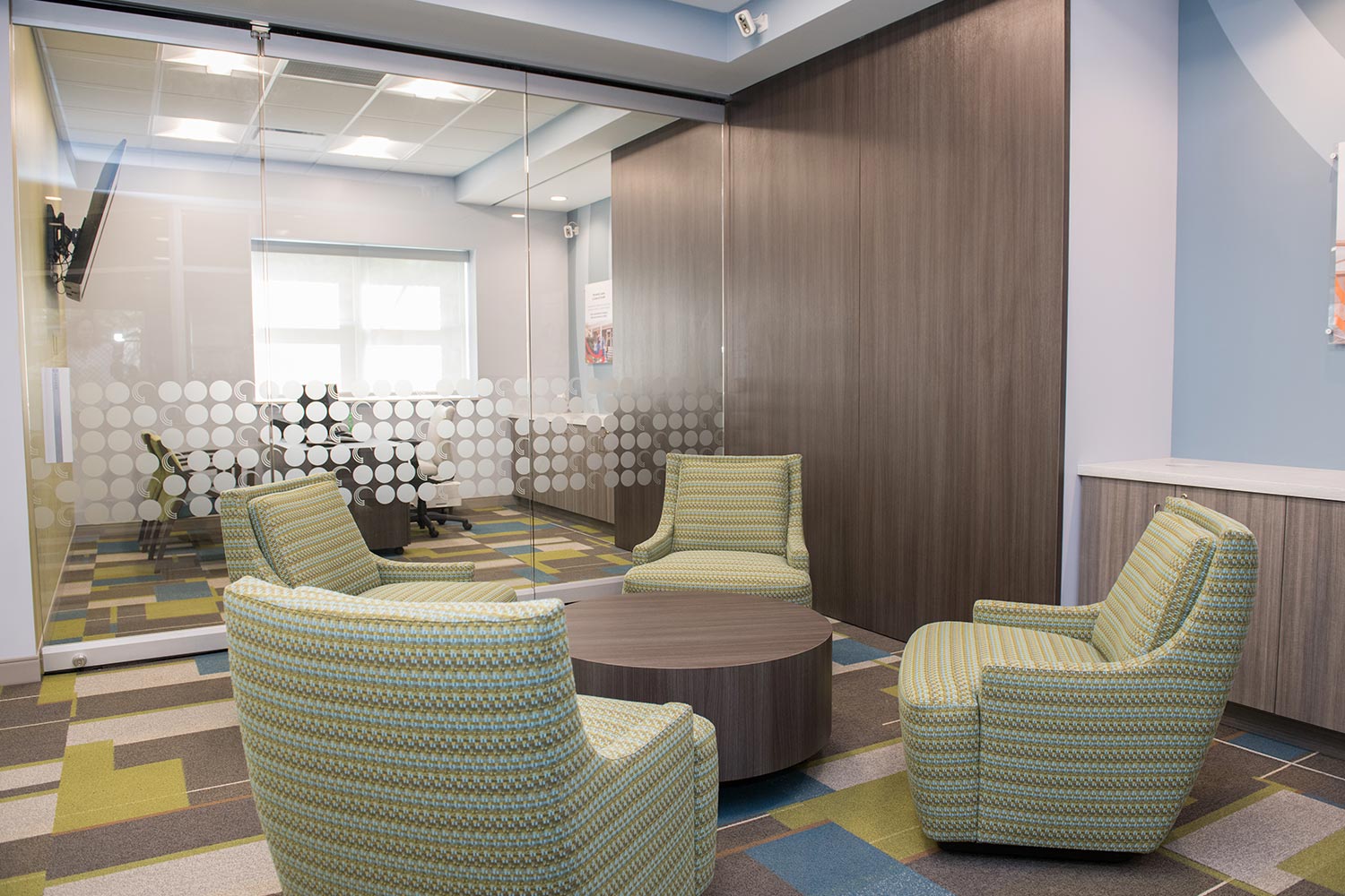
The branch was designed to have a series of branding “hits” for maximum impact. The ATMs in the vestibule and drive-thru are framed by circular branded surrounds, similar to the large illuminated circular branding feature behind the pod. Large branded graphics appear on walls throughout the branch. The minimal approach maximizes the impact of each branding element.
The client chose a color palette that was bold and dramatic. They wanted to make a statement in this new market, and they succeeded in a striking yet stylish way.