2,400 sq. ft.
One Monarch Place, Springfield, MA.
This project was a renovation in a single-story section of an existing multi-story building in the center of Springfield, MA. The space included a high ceiling, around 35-40 feet, with a lot of wood detailing. It was previously a Bank of America before United Bank took it over. The building’s landlord was demising the space so that there was a Starbucks on one side, and United Bank on the other.

A view of the long pod at United’s urban branch in Springfield, MA.
This was quite a different branch interior in that there was a lot of wood paneling of the walls, and a very decorative ceiling. Everything bore a standard older, legacy look. The client didn’t want the branch to stay traditional, but to save money they decided to be somewhat transitional so they could work with the existing panels etc., but create a fresher and brighter feel to the space.

The branch has a high ceiling and some beautiful detailing, which was complemented by the newer design.
The original design intent was to use as much of the existing material as possible, adding the detailing for the new wall in a way that would blend in with the existing look. We removed the teller line and stone floor, and set about marrying the new look to the old, which was architecturally challenging as there was a lot of detailing in all surfaces that had to complement the new.

The sit-down section of the curved pod with a flat-screen display behind it.
We originally intended to have a large branding feature high up on the wall but it was decided the branch would be best served by directing peoples’ eyes down toward the platform rather than up above. We designed the interior so that the upper part of the space would support the rest of the branch without stealing too much attention.

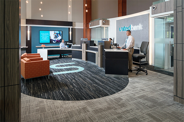
A broad view of the branch showing the branded carpeting, strings of lights, and illuminated branding on the wall behind the pod.
The architect designed strings of hanging lights that added presence to the large volume of space while keeping the focus down on the pod area.
There is a long, curved pod in the platform, which is the first ultra-modern type branch this client has launched. There’s a chandelier above the platform space, and a branded carpet in front of the pod. There’s a large flat-screen display at one end of the branch behind the pod, and a beverage center close to the exterior doors. The branch has two entrances, which we designed to have very different effects as customers approached the platform. One entrance comes from within the building, and the other enters from the exterior plaza.

The glass doors that lead into the branch from the building are visible in this shot, and the ATM inside the branch.
We designed an illuminated sign on the wall behind the sit-down section of the pod, which was a new thing for this client. The front of the branch is very transparent, with a lot of glass used in the offices, so the sign is clearly visible from the plaza outside. The client also wanted a more urban feel to this branch, which was a transition from the more traditional architecture of the past to closer to what we built in the center of Hartford for the United Bank Asylum Street branch we renovated there.
We also built offices, including the ceilings, which had to conceal all mechanicals. We achieved this by constructing a kind of parapet, so there was a mezzanine effect above the offices under the high ceiling.

A look into a glass office. The transparent front of the branch allows the branding and other features to be seen from the building’s exterior.
We designed a lot of different features in this relatively small space, working with the client and the building owner, which was challenging. A renovation of the plaza outside the building began while we were under construction inside the space, which also created some logistical challenges in terms of material deliveries to the job site.
The project went very smoothly overall, and the client loves the sleek and sophisticated look of this urban banking space.

Another view of the glass-walled offices that enable traffic passing in the street to see the illuminated branding behind the pod.


